
Logos aren’t just for corporations! They are the recognizable visual representation of a brand, capable of promoting that brand’s offerings and unifying a community around it. Nowhere is this more apparent and important than in the world of music. Let’s explore some the world’s most iconic 15 rock band logos and the hidden meanings they contain.
- The best rock logos are dynamic yet simple.
- Imagery representing aerial maneuvers, fire, and youth appear in many rock band logos.
- The most impactful logos are lettermarks or wordmarks with symbolic elements.
Weezer
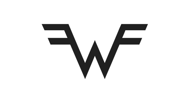
Vaguely reminiscent of superhero and wrestling emblems, Weezer’s dynamic letter mark encapsulates the band’s geeky subject matter and eclectic genre. An elegant and pointed W features double bars on its terminals, evocative of aerial imagery and technical mastery. All together, this logo perfectly illustrates Weezer’s clever infusion of Cali culture into musical innovation.
Queens of the Stone Age
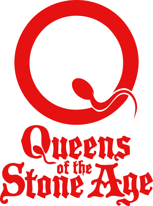
This provocative yet elegant logo is a clever letter mark if we’ve ever seen one. A cartoonish sperm makes its way into a thick bordered circle that signifies an egg. The placement of the sperm doubles as the tail on a “Q.” The crimson red coloring contrasts with the minimalist illustration for a gritty yet oddly beautiful logo. Some versions of the logo also include a medieval inspired typeface with the band’s name.
Sex Pistols
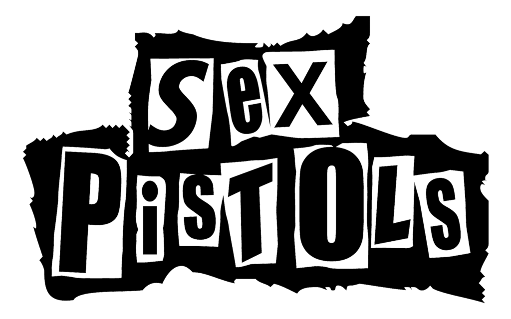
Modeled after a teenager’s collage, or perhaps even a ransom note, the Sex Pistols’ logo is a collection of letters that appear to have been ripped from a magazine. Each letter is white text on a black background with uneven cuts, set against a torn white “paper.” That alternation between white and black is eye catching for sure. The entire logo is provocative, youthful, and dynamic, just like the band itself.
Nine Inch Nails
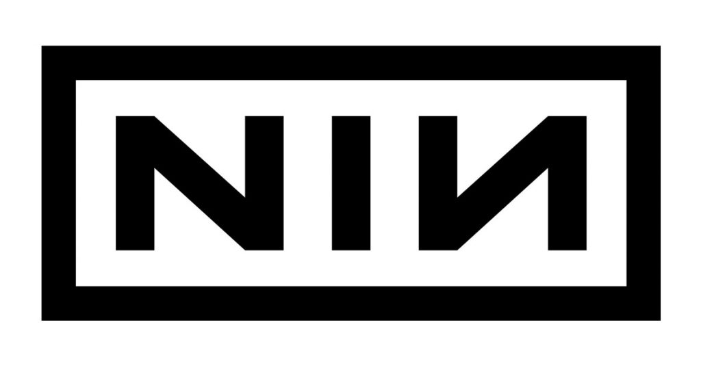
As a seminal force in industrial metal, Nine Inch Nails needed a gritty, recognizable logo that suited their rough aesthetic. Their letter mark, comprising the initials NIN, features mirrored “N’s” that appeared to be engraved into distressed metal. This unique logo both resembles a factory imprint and hints at the band’s industrial style. It’s also easily printed on merch, which makes it a perfect band logo!
Aerosmith
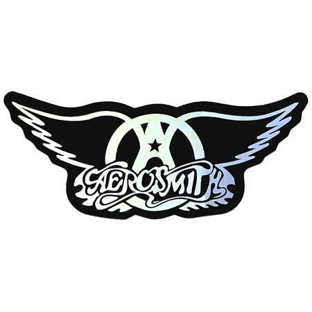
Featuring a circled “A” with widespread wings, the Aerosmith logo signifies rebellion, freedom, and power. A small star in the counter of the A hints at the band’s astronomical style and luminous aesthetic. In some versions of the logo, the “A” is topped by a small circle, creating a stick figure who appears to have wings. Add in the hand drawn word mark with dramatic swings surrounded by fire, and you’ve got an epic logo that perfectly captures this iconic glam metal band.
Muse
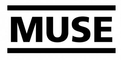
While rock logos tend to be a bit “extra,” the word mark of British alternative band Muse is minimalist yet bold. This is by design as the group’s music is both transcendental yet incredibly anarchist. Their logo’s simple, moderately kerned text against a black background, bordered by thick horizontal bars, signifies both openness and the oppression that the band implores its listeners to escape.
AC/DC
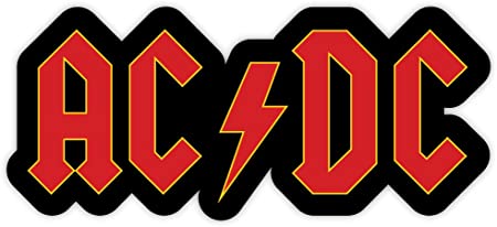
Named for the two types of currents in electrical wiring, AC/DC needed a logo that honored its namesake and expressed the manic energy of its music. This distinctive logo features an angular, tall typeface with tight kerning and diamond terminals. Reminiscent of typefaces seen on old circus posters, this word mark captures the band’s showmanship and high voltage performances. A lightning bolt separates the “AC” and the “DC” for a literally electrifying touch.
The Darkness

Cursive fonts are notoriously difficult to use in logos, yet The Darkness’s word mark perfectly blends a script type with a dynamic, sweeping logo design suited to its atmospheric and intricate music. With tight kerning, dramatic swings from the “D” and “K,” and an enticing arrow that sweeps upward from the “D,” this logo evokes imagery of old school glamour, soaring vocals, and gothic intrigue.
KISS
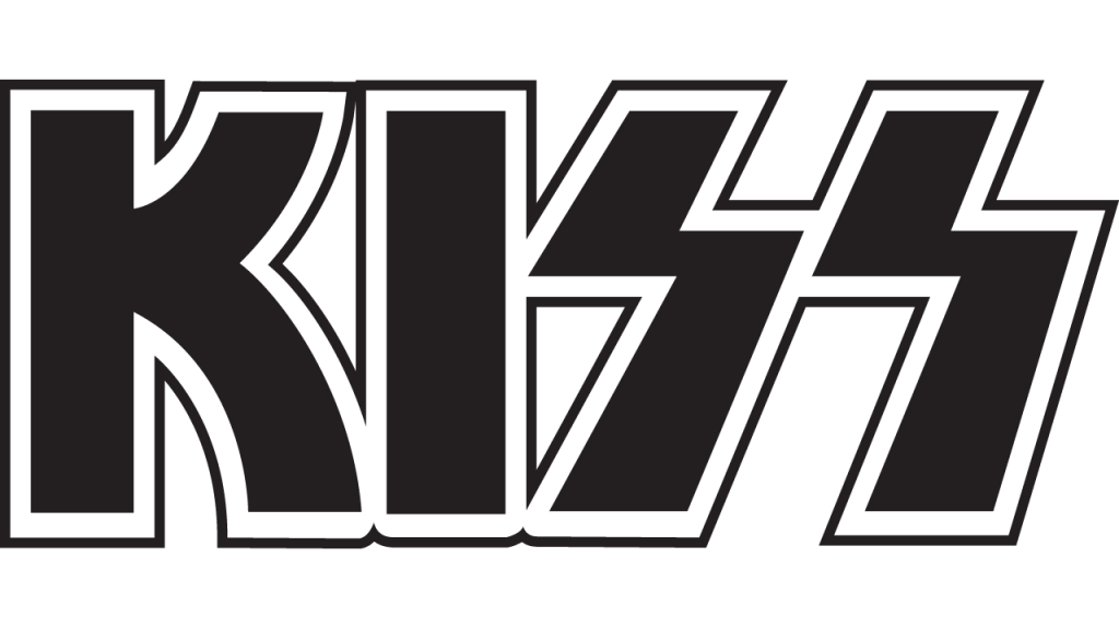
Arguably one of the most recognizable word marks in rock and roll, KISS’s logo is simple yet impactful. Blocky letters with zero kerning and inset borders give it a punch that reflects the band’s comics inspired aesthetic and powerful sound. One of the logo’s best features is the stark contrast between the “K’s” curved legs and the angular “S’s.” The latter almost look like lightning bolts, signifying the band’s power and supernatural identities.
Radiohead
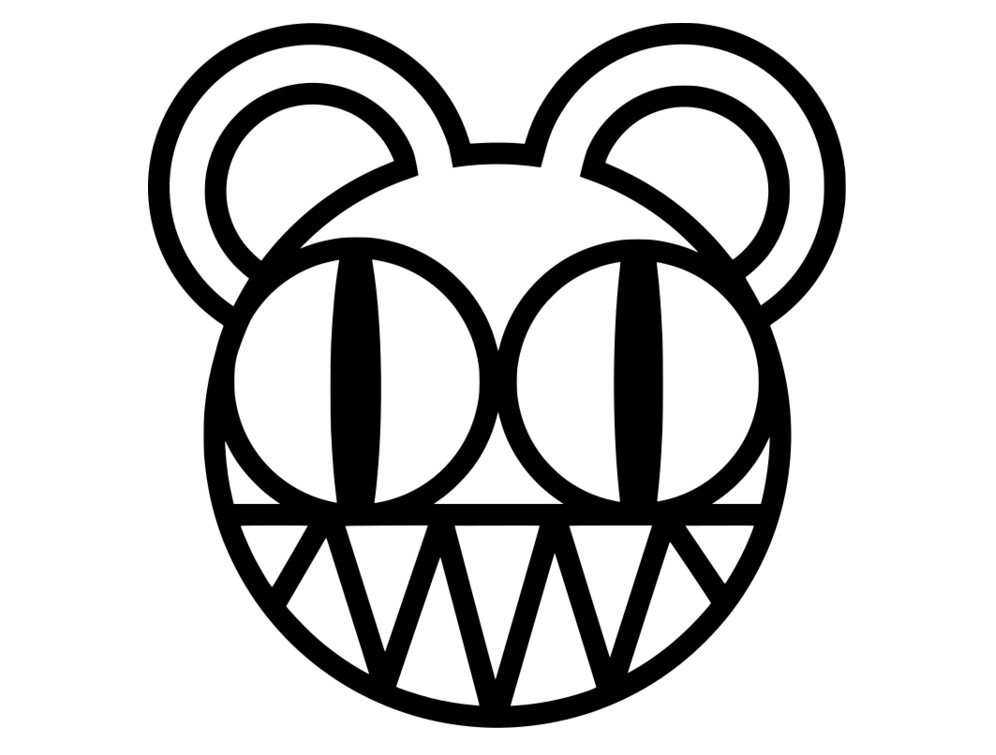
Radiohead is famous for unveiling darker truths and primitive impulses, even in their aurally pleasant songs. Their famous bear logo, co-designed by Thom Yorke, has a threatening yet winsome aesthetic. Featuring a blocky illustrated style, zigzag teeth, and eyes that vaguely resemble radio dials, this provocative illustration appears on none of the band’s album art. Still, it’s been a fan favorite for Radiohead merchandise.
The Struts
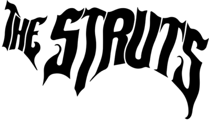
Neo glam rock band The Struts honors its influences in its unique word mark. Drawing upon Aerosmith’s and The Darkness’ wavering typography, The Rolling Stones’ sensual aesthetic, and the Sex Pistols’ provocative style, the word mark is rendered in a dripping circus typeface. A semicircular distortion adds dramatic intrigue while the tilted axis implies dynamism and innovation.
The Who
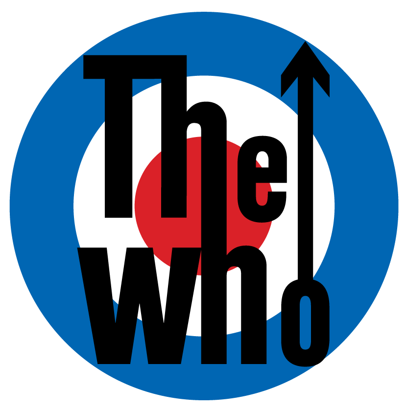
This logo has many variations, some more British than others, but all feature the distinctive typography that forms the core wordmark. The descender of the first “h” drops to merge into the ascender of the second “h.” Meanwhile, a slim arrow with a large head extends upward from the “o.” This design captures the band’s uplifting style while signifying its dynamic yet classic rock aesthetic. In various versions, the word mark overlays a bold blue circle with an inner red dot (reminiscent of the London Underground and Royal Air Force logos), or the Union Jack itself. But it’s the unique font design that makes this logo pop.
Iron Maiden
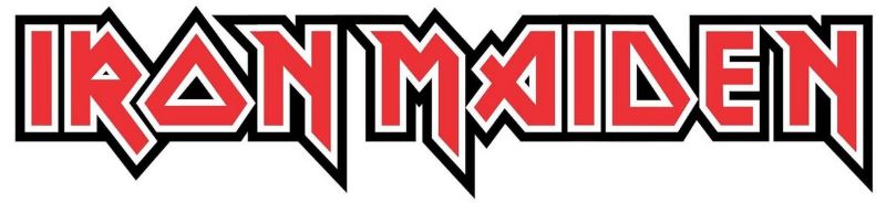
Iron Maiden’s distinctive logo features asymmetrical typography, metallic drop shadows, and sharp angles. The band’s name is printed in a jagged font with pointed descenders, and the axis is tilted just enough to suggest danger. The letters also seem to be made of metal, which is appropriate for a metal band. While some versions don’t have this effect, the bold and fierce design choice stands. This logo’s sleek yet provocative design captures both their genre and their namesake.
The Rolling Stones
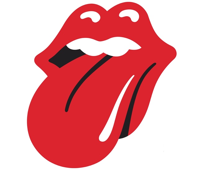
As one of the UK’s most seminal bands, The Rolling Stones need only a strong logo to express their brand. The iconic image of a wet mouth with its tongue sticking out is one of rock’s most compelling images. Originally designed by John Pasche for the band’s “Sticky Fingers” album, the artwork became so beloved that it popped up everywhere. Eventually, it became that band’s complete visual representation.
The Misfits
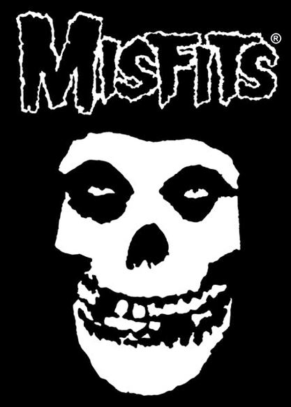
Called “The Crimson Ghost,” The Misfits’ iconic skull has become one of the most recognizable band logos in the world. The illustration was originally corrected for a movie of the same name. As the Misfits frequently parody B-list science fiction and horror films, the Crimson Ghost was the perfect choice for a logo. The skull’s deep-set eyeballs and garish smile give it a frightening appearance, while the logo’s overall rough appearance speaks to the band’s punk rock roots.