
We often see so many logos in our day-to-day life that we tend to not take the time that’s needed to really see them. We glimpse them and see them both online and on products in real life, but not all of us have taken the time to truly look at them and see what’s hidden behind the initial look. Most of us may be familiar with the world’s most famous logos and what they look like, but how many of our readers know how many of those famous logos have meanings hidden behind them and what they are?
- We see famous logos every day in our lives, but how many of us notice what’s behind how they initially appear?
- Some of the most famous logos in the world have meanings hidden behind them that you may not notice at first glance
- We take a look at ten of the world’s most famous logos with hidden meanings
As it turns out, some of the most well-known logos in the world were created to indicate something more than what we initially see. Let’s take a look at these famous logos and what hidden meanings are behind them.
Baskin Robbins
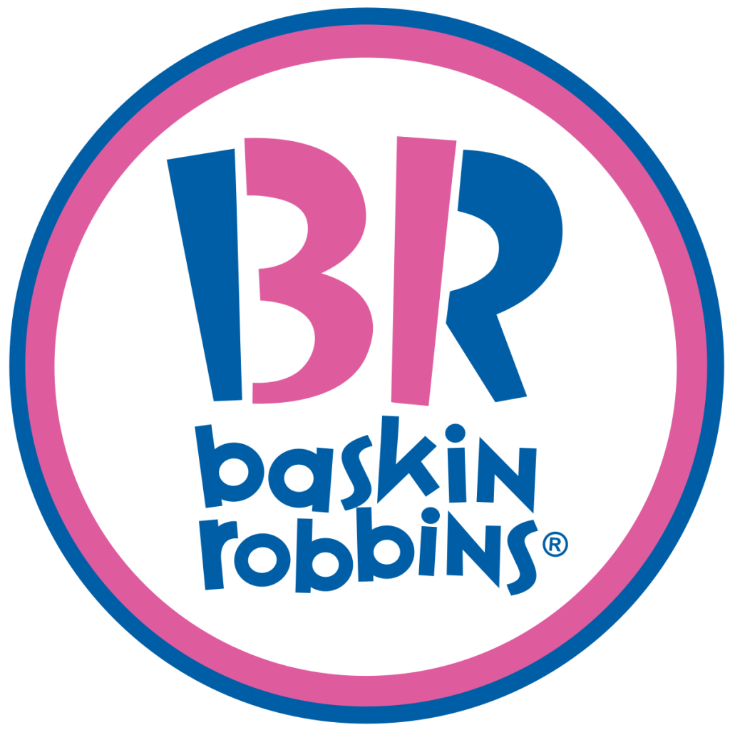
Image sourced here
One of the world’s most famous ice cream chains has a meaning hidden within its logo, where you’ll see the ‘BR’ that stands for their company name. If you look closely at the letters you may see more than just the initials of the company. The BR doubles as a 31 that stands for their promise to their customers; 31 ice cream flavors, one for every day of the month.
Apple
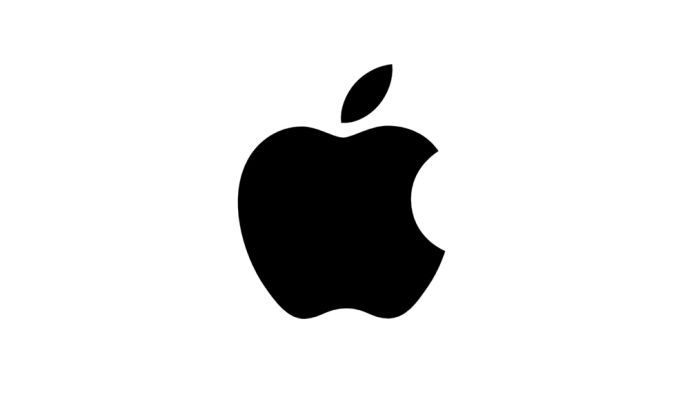
Image sourced here
Although maybe not as commonly unknown, Apple also has a hidden meaning behind its famous logo. The brand is one of the most well-known, with high-quality products and an incredible brand story that’s helped the company become as famous as it is today. Rob Janoff, the designer behind the famous Apple logo, says that it wasn’t even intentional to include a hidden meaning in the logo. When he was experimenting with ideas for the design, he realized that an apple with a ‘bite’ taken out of it sounded exactly like a computer ‘byte’.
Hershey’s Kisses
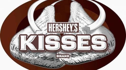
Image sourced here
The legendary chocolate brand that’s most well known for their individually wrapped chocolate kisses has a second kiss hidden in their logo. Although you may not see it as first, upon further examination you’ll see the secret kiss hidden in the name. Look closely between the ‘K’ and ‘I’ in the name and tilt your head slightly to the left and you’ll see the hidden kiss.
The Bronx Zoo
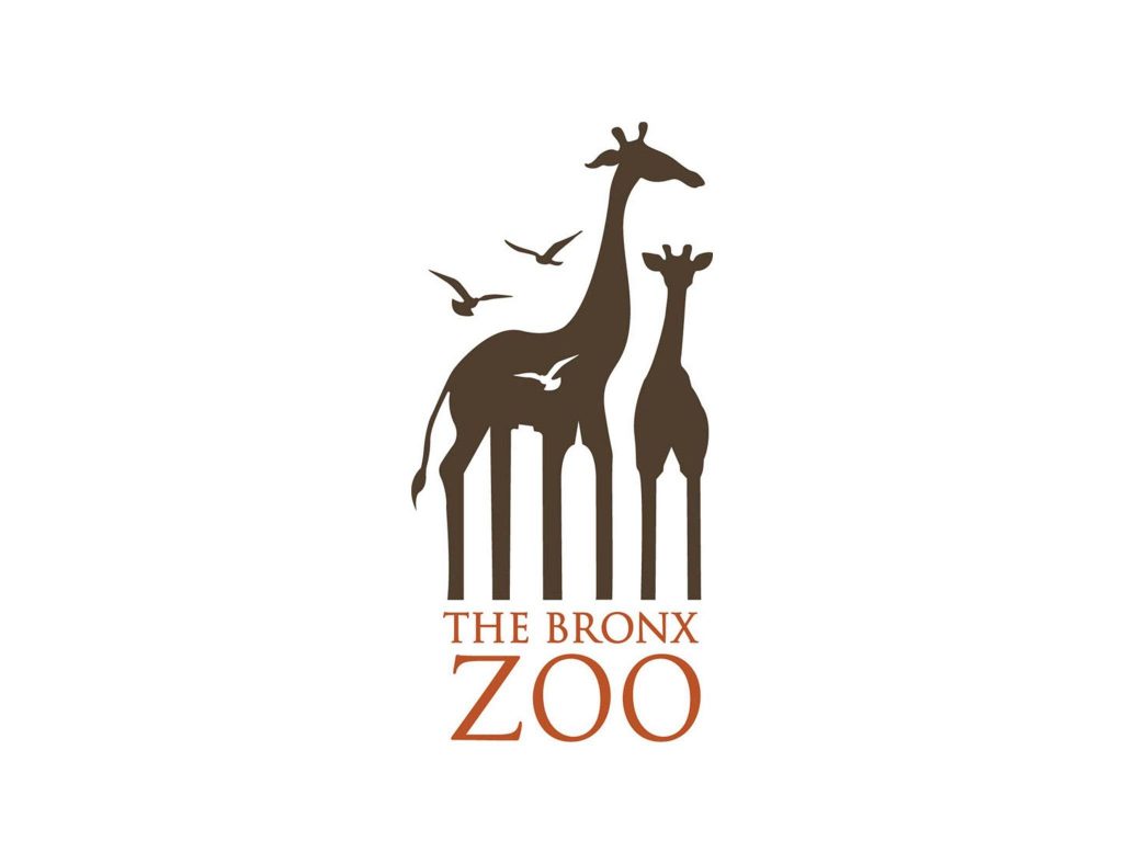
Image sourced here
One of the world’s largest zoos shows giraffes and birds in their logo, but that isn’t the only thing that’s in their logo! The zoo can be found in uptown Manhattan which is why you’ll see the New York City skyline hidden in the logo between the giraffe’s legs. This invites visitors not only to explore the zoo and what it has to offer but also to explore New York City!
FedEx
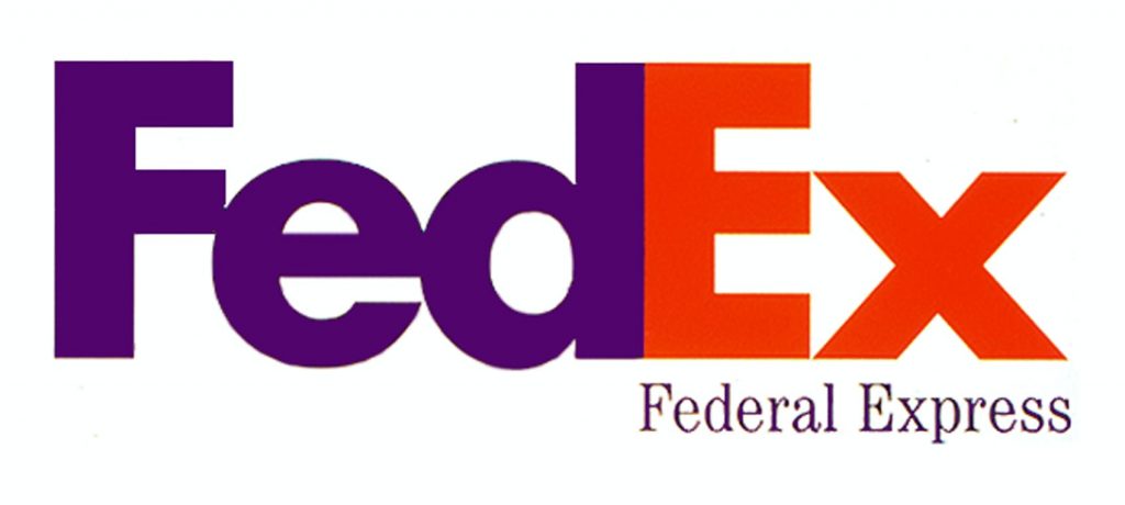
Image sourced here
The colorful FedEx logo has used the negative space in its logo to incorporate a hidden meaning beyond the company name. If you look closely between the ‘e’ and ‘x’ in the logo you’ll see an arrow, signifying their speedy delivery. This was certainly a creative idea and one that shows what you can do with a little negative space in your design.
Amazon
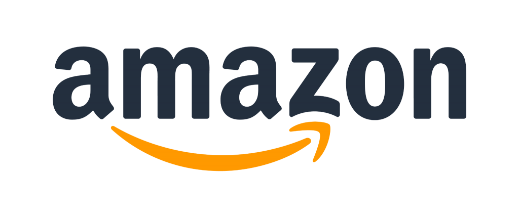
Image sourced here
When you first glance at the Amazon logo that I’m sure we’re all familiar with it doesn’t appear to be anything out of the ordinary. The logo is merely the company name with an orange swooping arrow below it. Although the hidden meaning isn’t as straightforward as some of the others on this list may appear, it still subtly hints at two different meanings. One is that the orange arrow seems to appear as a smile on the logo. The second is that the arrow begins at the ‘a’ and stops at the ‘z’, signifying that the online shopping platform carries everything from ‘A to Z’.
LG Corp
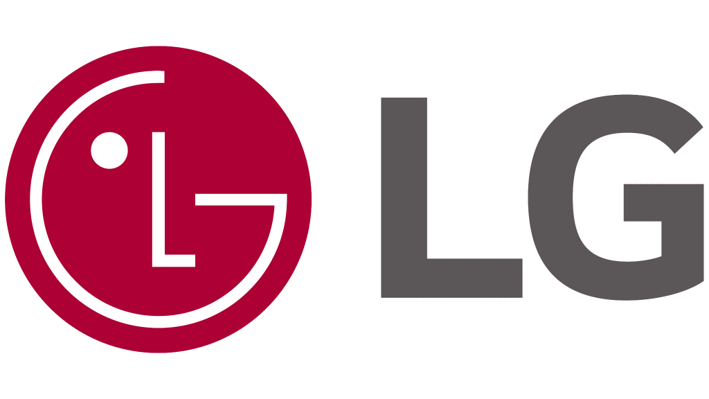
Image sourced here
The electronics company has a logo that shows the ‘LG’ to the right and the red design to the left of it. When you look at the red design you’ll see that it shows a stylized image of a person’s face, which the company has said is to signify their ordinary human relations with customers. Although this one may be more obvious to our readers it certainly is worth noting.
Goodwill
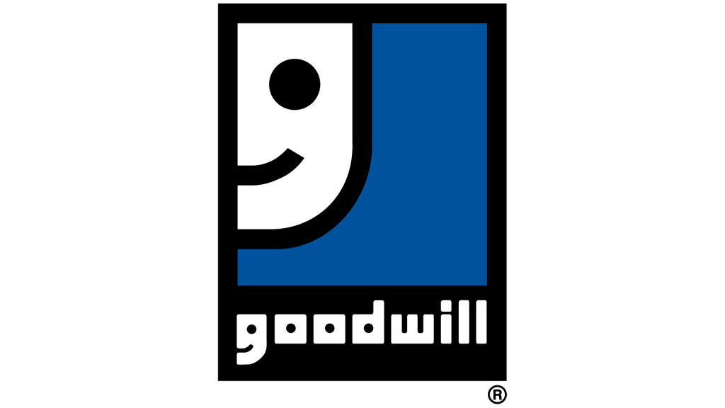
Image sourced here
We’re all familiar with the large smiley face up in the left-hand corner of the non-profit’s logo, but how many of us know about the second smiley face? If you look at the name below the logo at the lowercase ‘g’ you’ll see a smaller smiley face in the logo. Although the second smiley face isn’t as obvious, it adds a nice subtle touch to the corporation.
Coca Cola
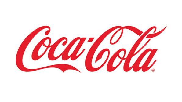
Image sourced here
This is one that is not only unintentional on the company’s part, but it’s also a very subtle part of the logo. Between the space of the ‘O’ and the ‘L’ you can see the Danish logo. Although this wasn’t intentional the company has used it in their marketing campaigns for their business.
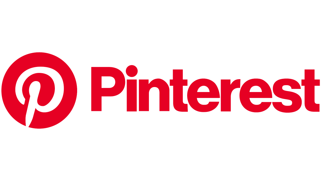
Image sourced here
The visual social media platform, Pinterest, is where you can seek inspiration and pin images to their online board. The platform’s famous red logo has a pin hidden into their logo in the letter P.